
<!-- SC_OFF -->
<!-- SC_ON -->
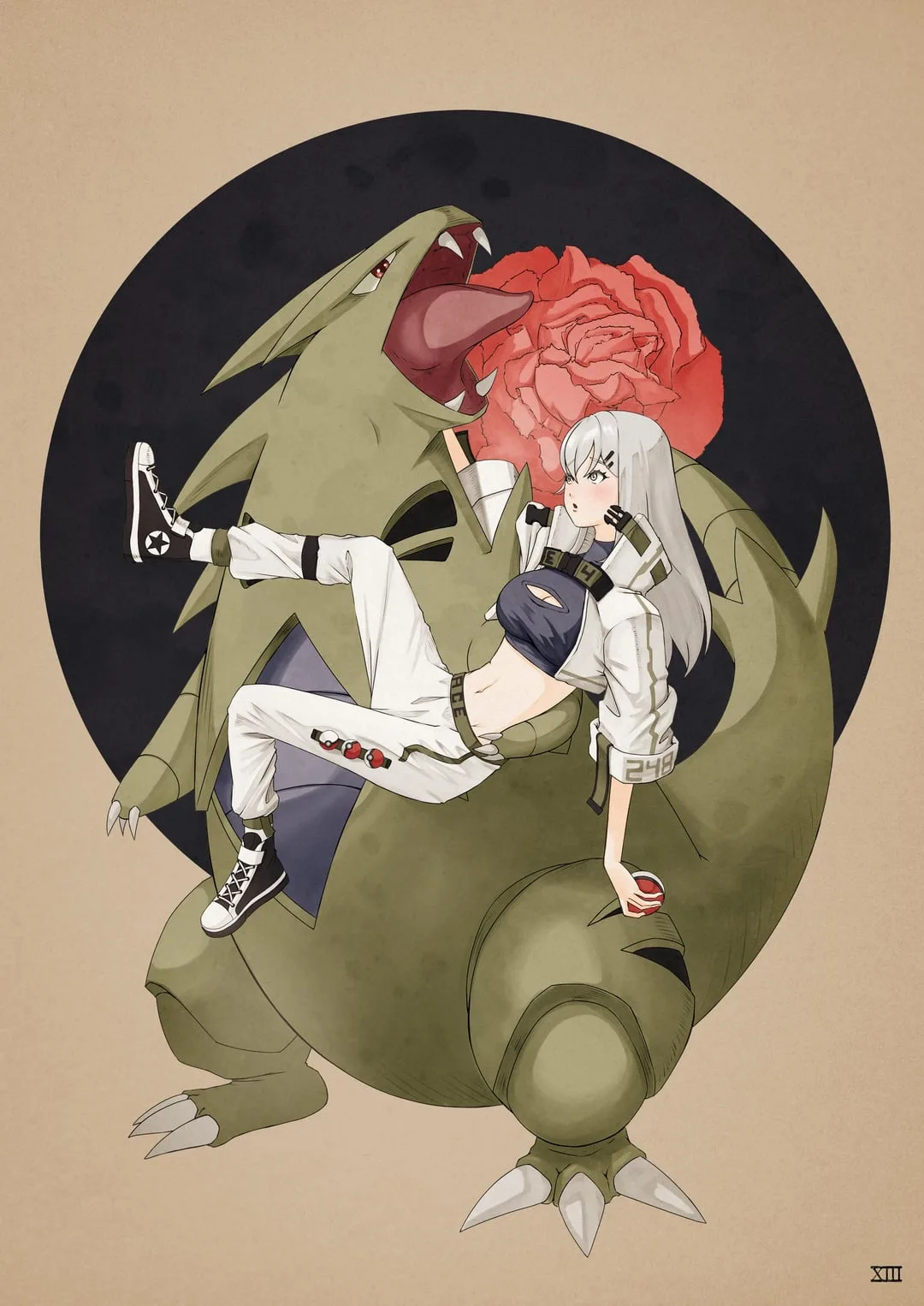
So, I don't hate where I'm at with my art, but I also am not fully in love with it. One thing is I wanna lean more into the anime anatomy. Things like the bigger head and you know it. Cute and cool kinda stuff.
I love the watercolor look I have, but I'm unsure of the sepia tone and the paper texture. Was curious about what others thought.
Just a few things I'm considering is:
- Back to brighter colors and bolder colors with a more washed look (Like that orange layer trick).
- More anime like anatomy.
- Maybe ditching the watercolor vibe I have going on in general.
Would love to hear some thoughts. Even if it's "change nothing, this amazeballs". Thanks guys and have a great day/night!
<!-- SC_ON -->




11.5K Views


